
Lead Designer
2025
Background
Guiding strength workouts with clear, impactful screens
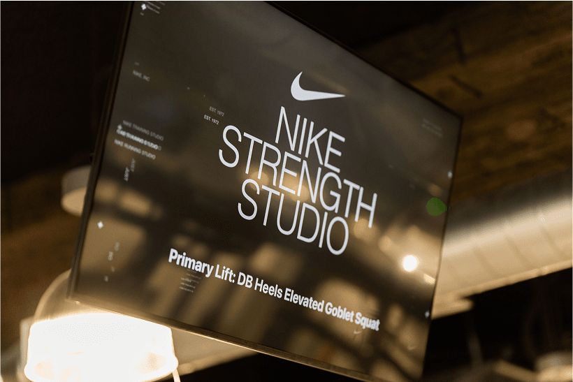
Nike Studios offers three training modalities: Training, Running, and Strength, each with unique programming. Large in-studio displays are a key part of the experience, helping trainers guide classes and keeping members on track. I contributed to the Training and Running Studio screens and led the design for Strength Studio in collaboration with the studio and performance teams.
Challenge
Flexible, accessible design for complex programming
Strength Studio programming ranges from straightforward circuits to complex, whiteboard-style workouts. The screens needed to accommodate varied formats, adapt to edge cases, and remain highly accessible in the physical studio environment.
Approach
The screens needed to guide members through any workout, in any condition. I designed clear layouts for instant understanding, improved visibility for the studio environment, and documented every detail so developers could deliver exactly what trainers and members needed.
01
Helping members follow workouts without confusion
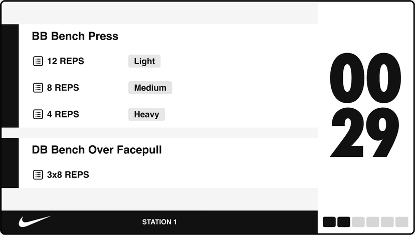
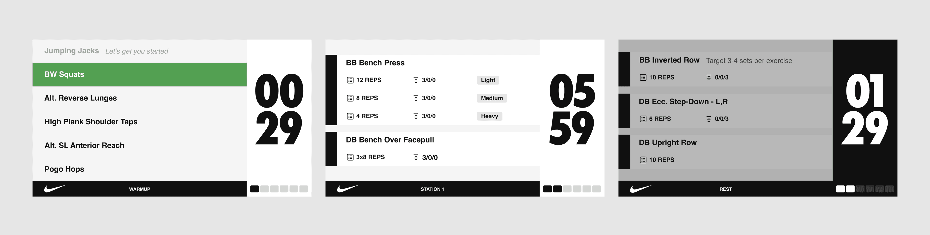
The screen layout was divided into two main areas, workouts and timer, to keep functions clear and easy to understand. The workout table featured a custom icon set for exercises, improving scanability while providing flexibility for varied programming needs. The timer included both a numeric countdown and a progress indicator, with distinct states for each class phase. This ensured seamless transitions and helped participants stay in sync with the workout flow without confusion.
Result: Trainers reported smoother class flow, and members were able to follow workout phases with fewer clarifying questions.
02
Ensuring visibility in challenging studio conditions
Given the distance between members and the TV displays, and the need to read text while moving through a workout, accessibility was a core design priority. The initial version used large type and balanced white space, but in physical testing, factors like lighting, glare, and mid-workout readability revealed the need for stronger adjustments. In later iterations, I increased the weight of all fonts and visual elements, and reduced excess white space and dividers, creating a cleaner interface that exceeded accessibility needs in the studio environment.
Result: In-studio testing confirmed improved readability in varied lighting, and members reported less difficulty reading the screens during workouts.
Try it yourself
What survives the distance
03
Reducing implementation errors through clear documentation
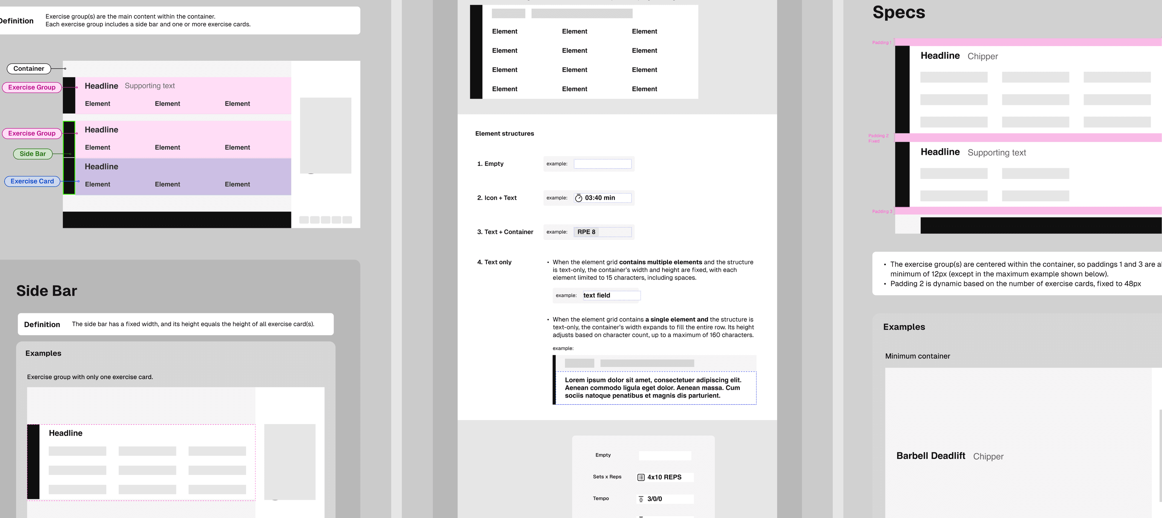
To ensure clarity and flexibility in implementation, I created a comprehensive handoff document for the development team. Using an atomic design approach, I defined all major components and accounted for possible edge cases. This documentation streamlined communication, reduced ambiguity, and ensured the final build met the functional requirements of both the programming and performance teams.
Result: The development team was able to implement the screens with minimal back-and-forth, and programming teams confirmed all edge cases were properly supported.
Impact
The Nike Strength Studio screens brought clarity and consistency to a complex training environment. By balancing flexibility with simplicity, the design supported varied programming while keeping members engaged and confident in following each class. The accessibility improvements ensured every participant could stay connected to the workout, and the detailed handoff process gave developers and trainers the tools they needed to keep the system running smoothly.